N/AN/A
Case Study
A fresh identity for protein on the move
The Challenge
Zelus offered a lighter alternative to protein powders and heavy shakes, but its identity made the product feel clinical and overly functional. It did not reflect the taste, convenience or personality that made the drink different. To reach padel clubs, social sports communities and everyday active people, the brand needed to leave the serious supplement world behind.
Our Approach
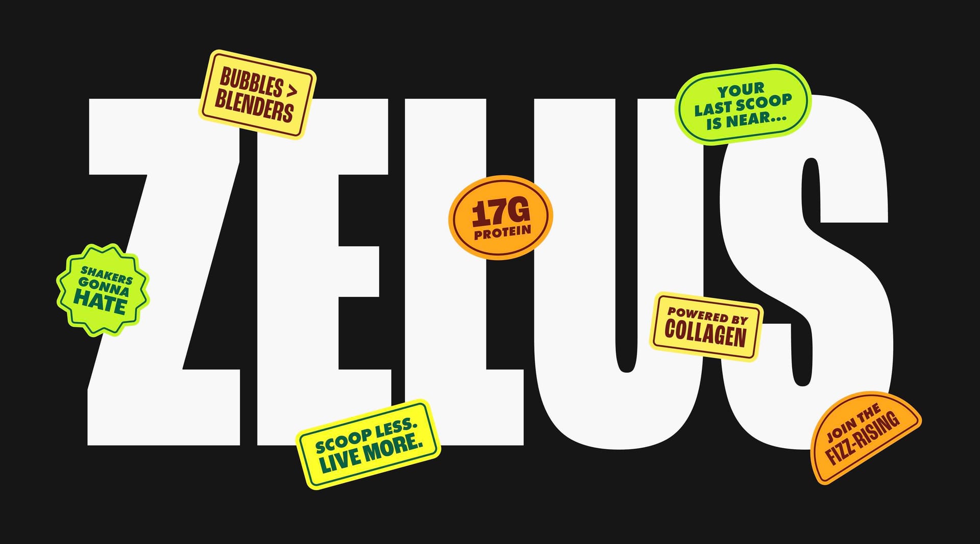
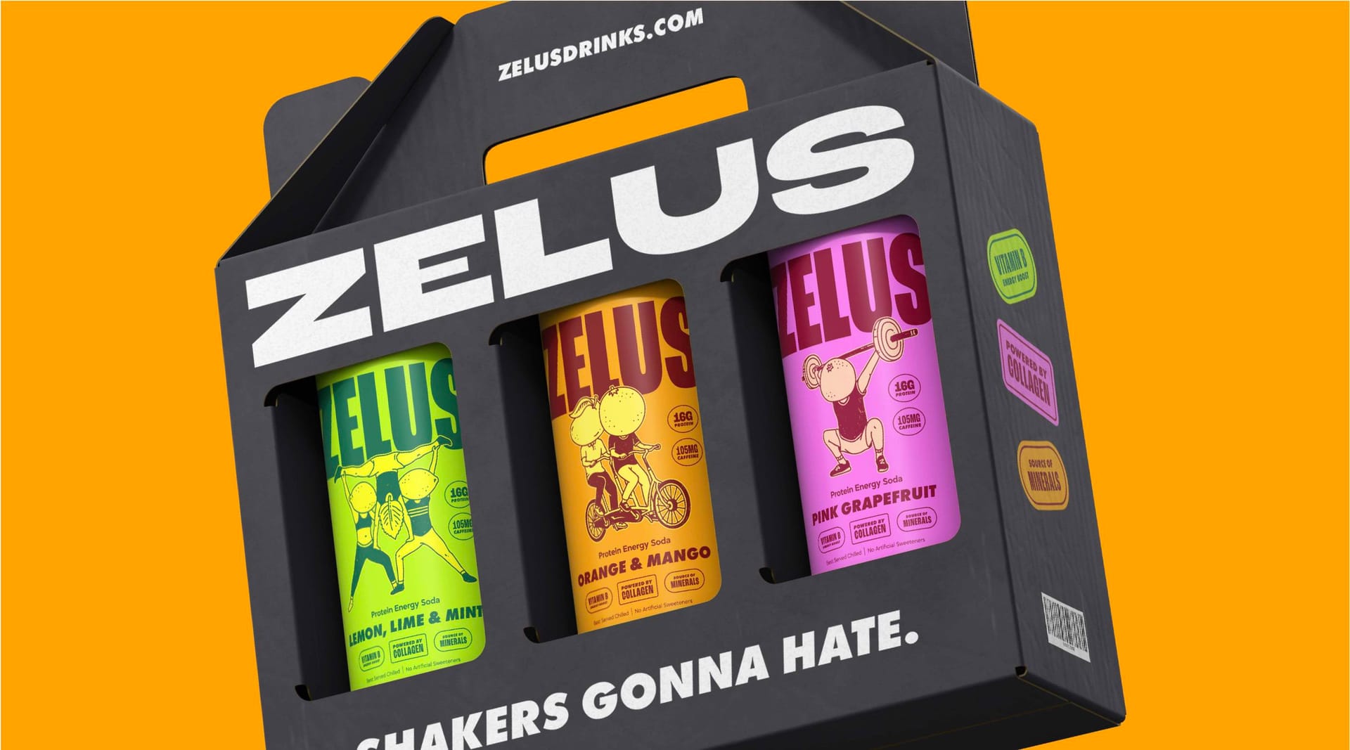
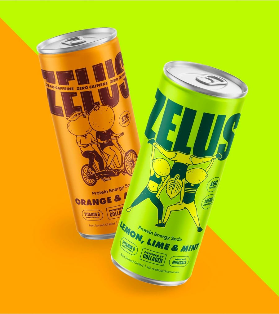
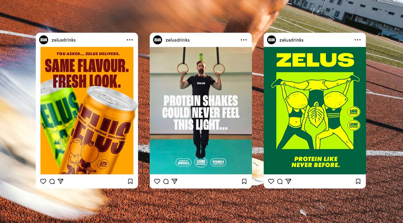
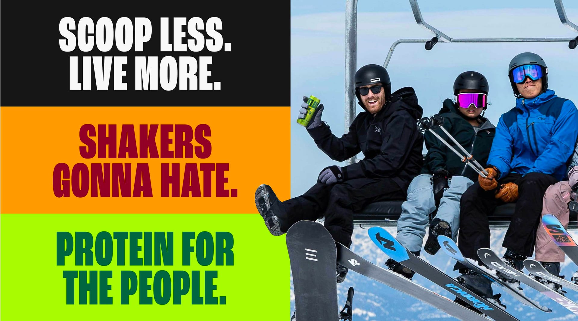
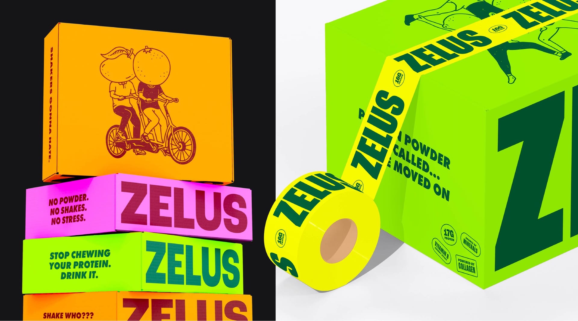
We repositioned Zelus around lightness, flavour, convenience and the social side of being active. Rather than focusing on intense performance, the strategy spoke to people who wanted to move, connect and enjoy themselves. That thinking shaped a bolder visual identity filled with energetic colour, playful typography, illustrated characters and a more confident tone of voice.
Our Solution
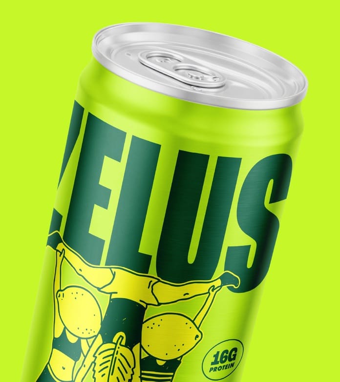
The new identity replaces clinical cues with colour, character and movement. Rolled out across packaging, the website, social content and campaigns, it gives Zelus greater presence on shelves and screens while connecting with a broader active audience. Our ongoing relationship continues to support the brand as it develops new ideas and builds its place beyond traditional gym culture.
Client perspective
“Weknewtheproductwasdifferent,buttheoriginalbranddidnotcommunicatetheenergyorpersonalitywewantedZelustohave.OnPoyntunderstoodthatweneededtomoveawayfromtheclinicalworldoftraditionalsportsnutritionandcreatesomethingthatfeltmuchmoresocial,accessibleandenjoyable.Thenewidentitycapturesthatperfectly.Itfeelsconfident,distinctiveandmuchclosertotheaudiencewewanttoreach.Theteamcontinuestosupportusasthebrandgrowsandnewopportunitiesdevelop.”
— Michael, Founder of Zelus
Client perspective
“n/a”
— n/a
Related work
View a similar project
Selected by category with a curated fallback so there is always something relevant to continue to.
Print
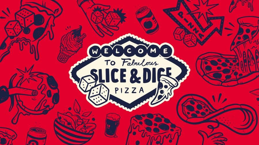
Slice & Dice
A Las Vegas themed pizza kiosk built around a simple hook: buy a slice, roll a dice, maybe win another. We designed the kiosk, signage, uniforms, social and packaging, then scaled it as the concept grew from Oxfordshire to London.
View Project
Print
Opal 22
Illustration-led branding for a Leicester Black heritage charity's flagship Black History Month events. We gave each event its own identity across a brochure, posters, leaflets and merchandise, creating cohesive assets the charity now owns and reuses year after year.
View Project
Branding
Endeavour Adventures
A scout-badge inspired brand refresh for a youth adventure holiday business. We updated the logo and built brochures, roller banners and social frames, giving a proven outdoor operator a fresher, more commercial and more trustworthy look built for growth.
View ProjectCREATIVE & BRANDING AGENCY
WHERE CREATIVITY, STRATEGY AND PURPOSE CONVERGE TO BUILD BRANDS PEOPLE BELIEVE IN
2026®