N/AN/A
Illustration-led charity event branding
A WEEK WORTH REMEMBERING
The Challenge
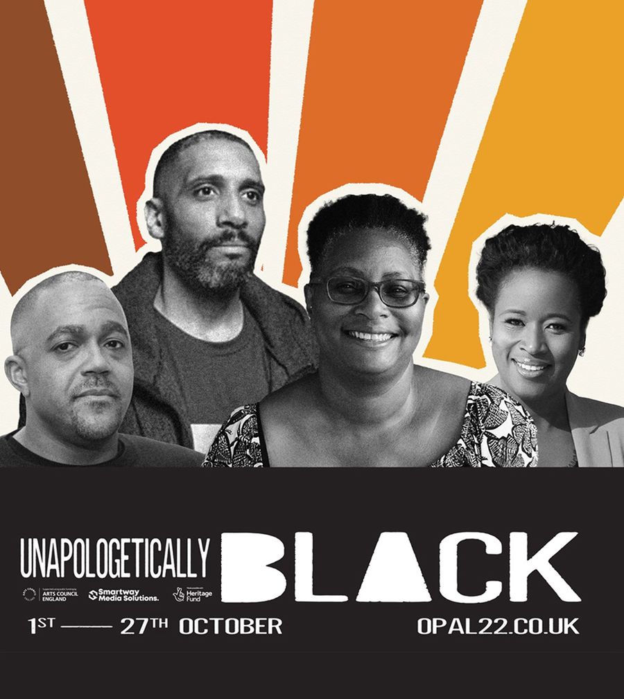
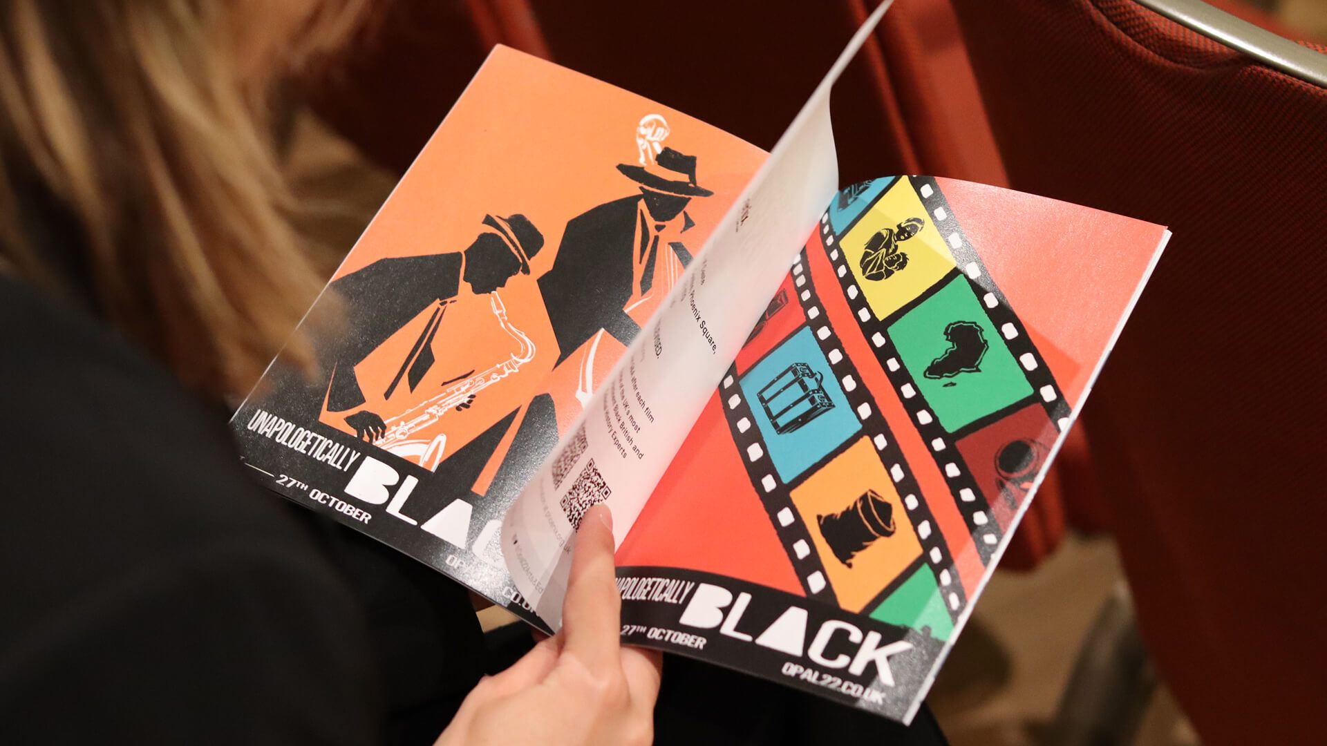
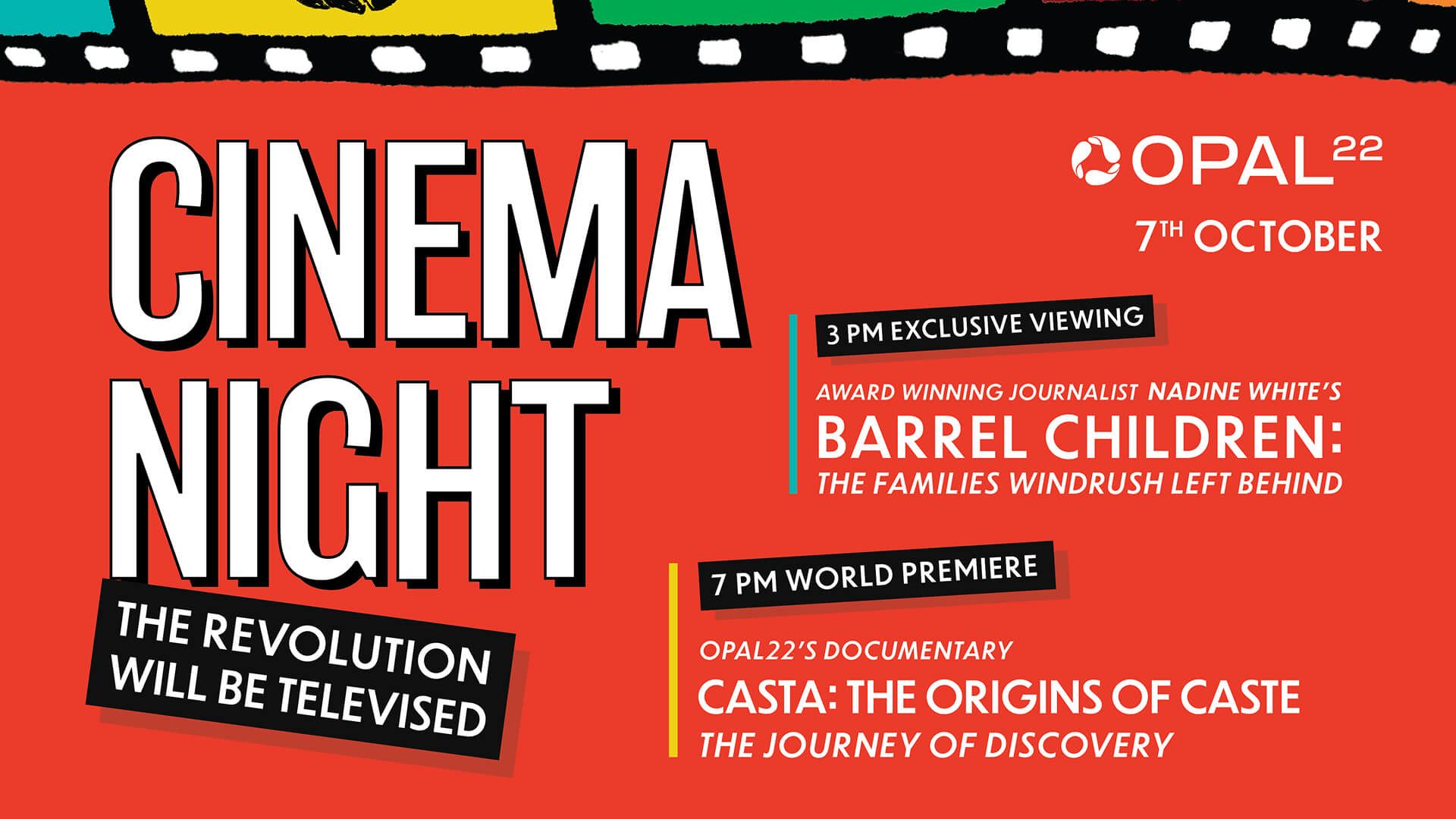
Opal 22, a Black heritage charity in Leicester, came to us with a flagship week of events for Black History Month already planned, but no way to promote them. They needed a brochure and booklet that could advertise a varied programme, capture the spirit of each event and carry the charity's tone of voice across print, digital and social.
The Approach
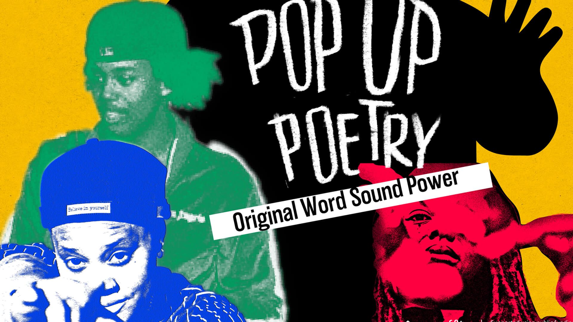
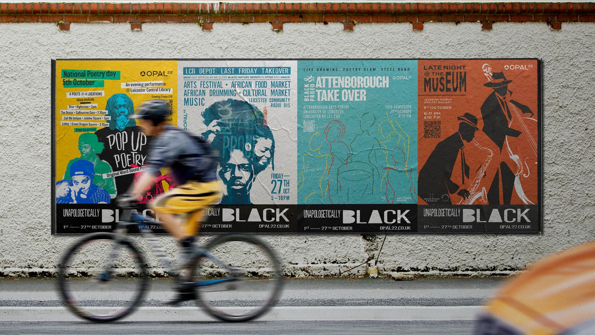
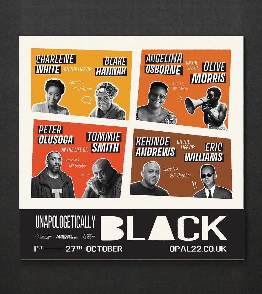
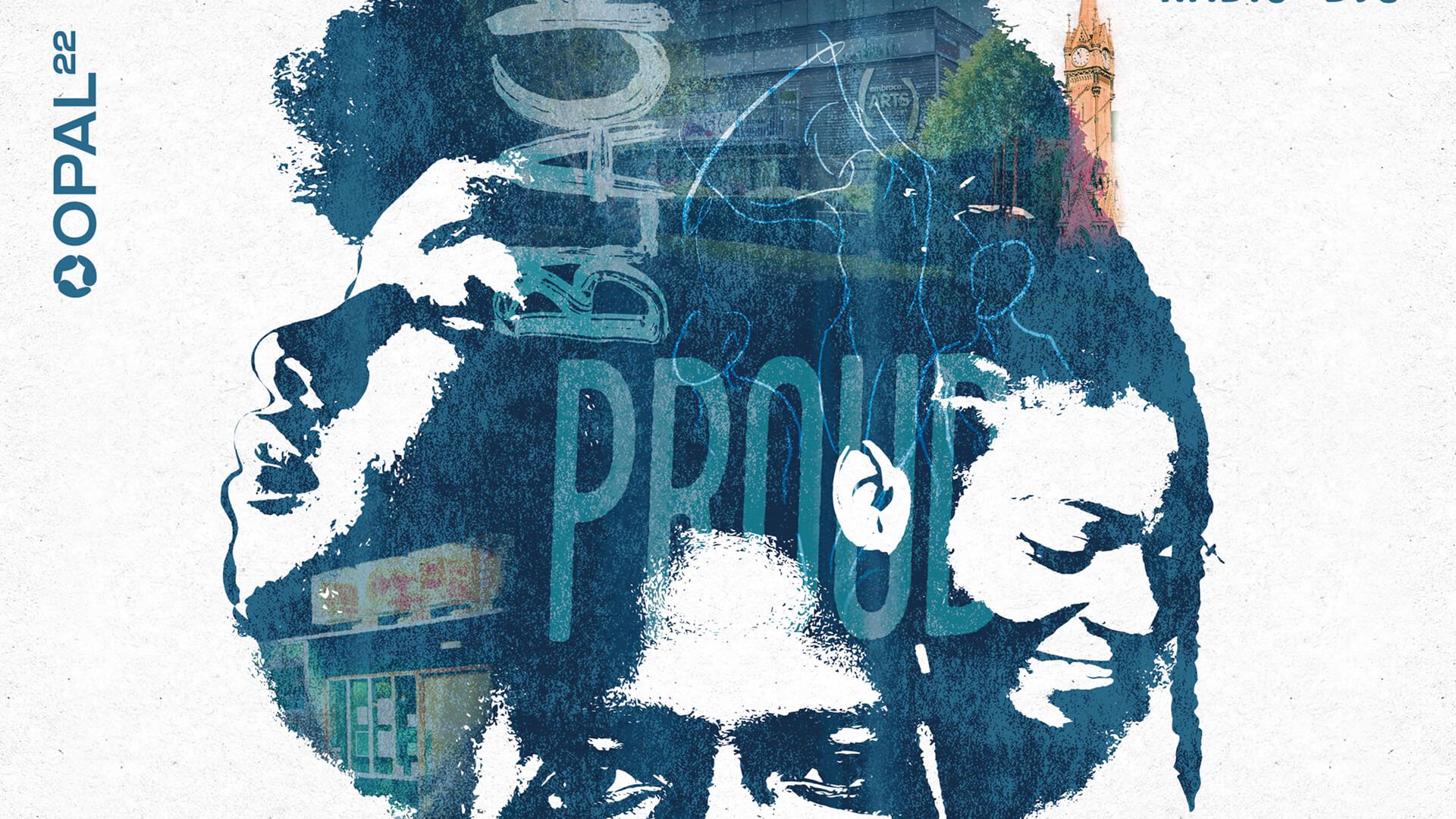
We gave every event its own identity, running illustration and a distinctive tone of voice through the whole programme. That illustration-led approach shaped a brochure, posters, leaflets, flyers and special pieces for the Windrush 70th anniversary, plus merchandise for their exhibition at Newarke Houses Museum. The result was one cohesive event brand that flowed naturally from print to digital to social.
The Outcome
The week was a real success. Collectable stamps in the back of each booklet encouraged people to visit every event and enter a prize draw, driving engagement across the programme. Because Opal 22 own the rights to the expressive illustrations and designs, they can reuse them for future years and occasions, giving the charity lasting brand assets from a single Black History Month campaign.
Client perspective
“n/a”
— n/a
Related work
View a similar project
Selected by category with a curated fallback so there is always something relevant to continue to.
Print
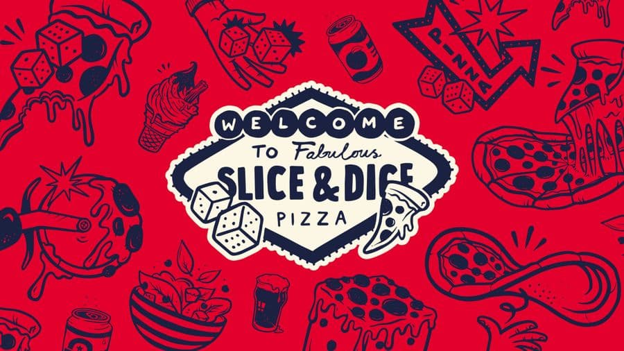
Slice & Dice
A Las Vegas themed pizza kiosk built around a simple hook: buy a slice, roll a dice, maybe win another. We designed the kiosk, signage, uniforms, social and packaging, then scaled it as the concept grew from Oxfordshire to London.
View Project
Branding
Endeavour Adventures
A scout-badge inspired brand refresh for a youth adventure holiday business. We updated the logo and built brochures, roller banners and social frames, giving a proven outdoor operator a fresher, more commercial and more trustworthy look built for growth.
View Project
Branding
The Inside Edge
A bold rebrand for a team training business founded by an ex-Army captain and England cricketer. Concrete textures, distress and sharp typography blend sport and military into one confident brand identity, complete with full guidelines built for future growth.
View ProjectCREATIVE & BRANDING AGENCY
WHERE CREATIVITY, STRATEGY AND PURPOSE CONVERGE TO BUILD BRANDS PEOPLE BELIEVE IN
2026®