Case Study
Giving great beer a story of its own
The Challenge
Round Corner Brewing already had an acclaimed product and a strong reputation for doing things properly. What it lacked was a clear story connecting the brand to the care, craft and character behind the beer. The identity needed greater purpose, giving the team something distinctive to stand behind and drinkers something meaningful to connect with.
Our Approach
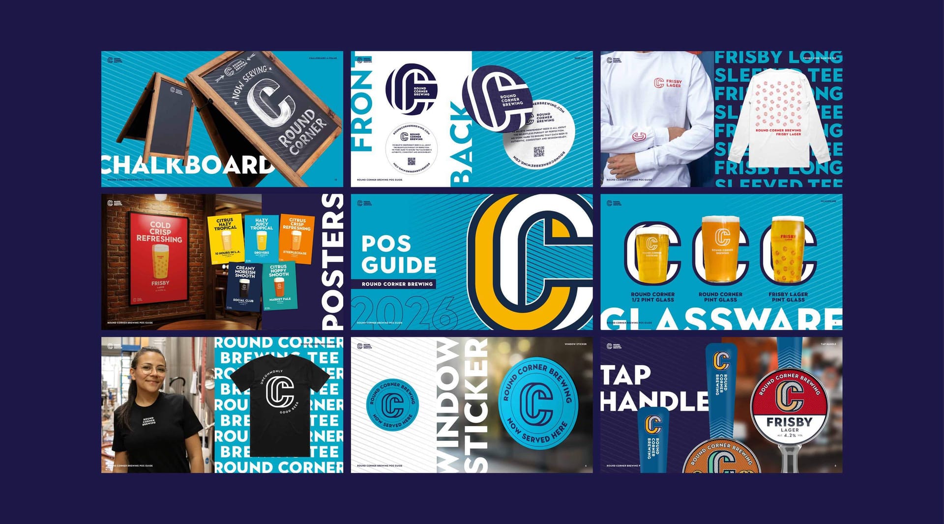
We worked closely with the founders to uncover what made Round Corner special, particularly its commitment to doing things properly, with care and craft. We translated that thinking into a clear brand story, tone of voice and values, then developed practical guidelines and creative tools to make it consistent across every touchpoint.
Our Solution
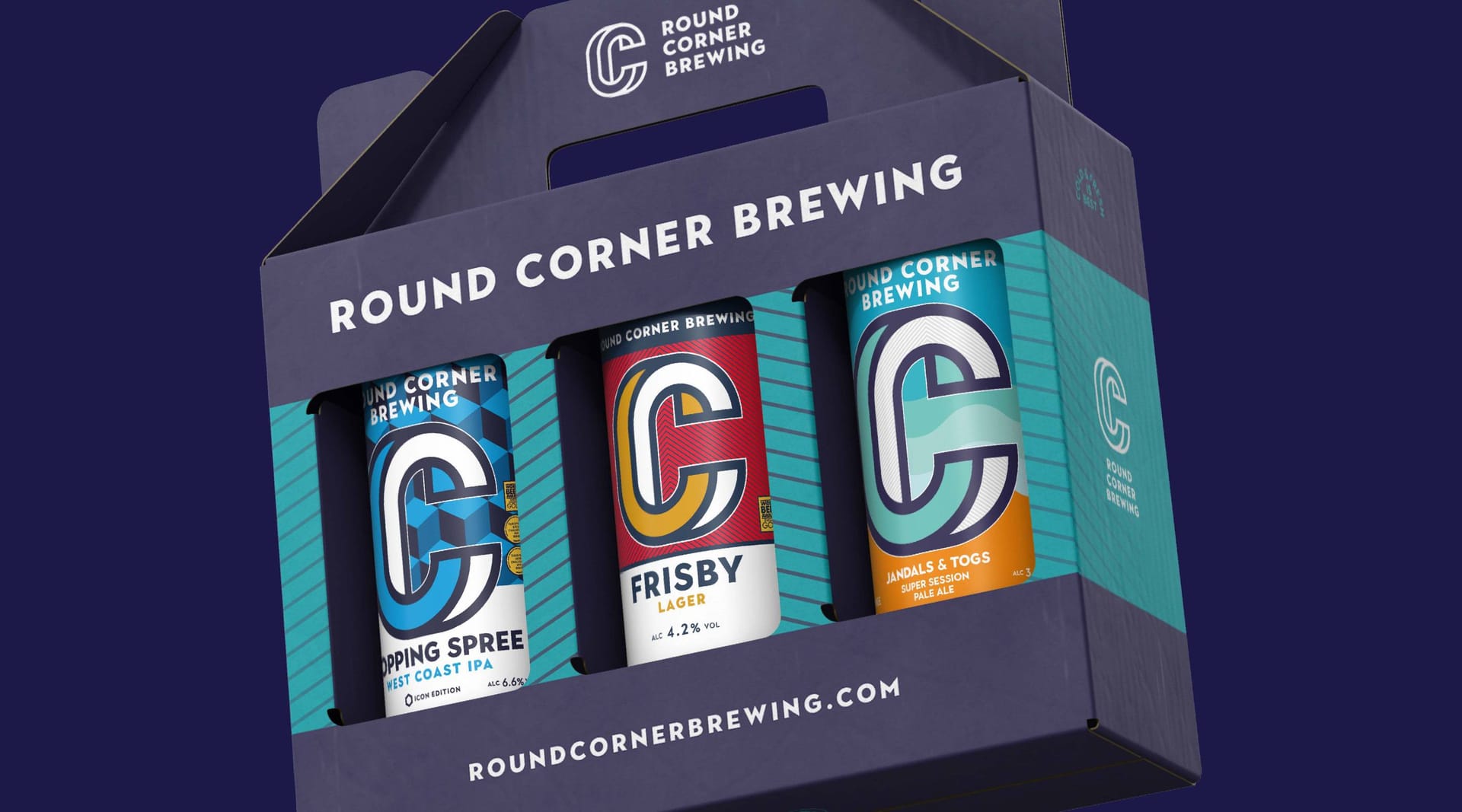
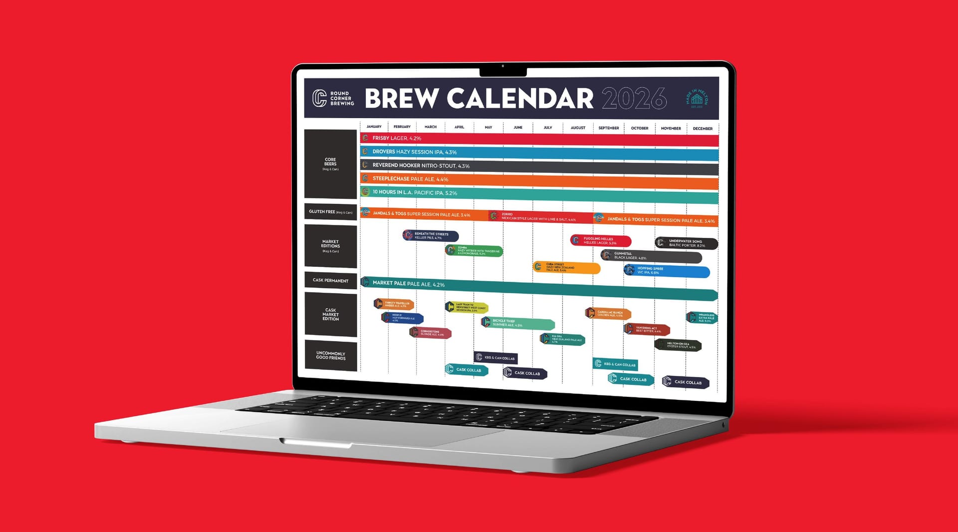
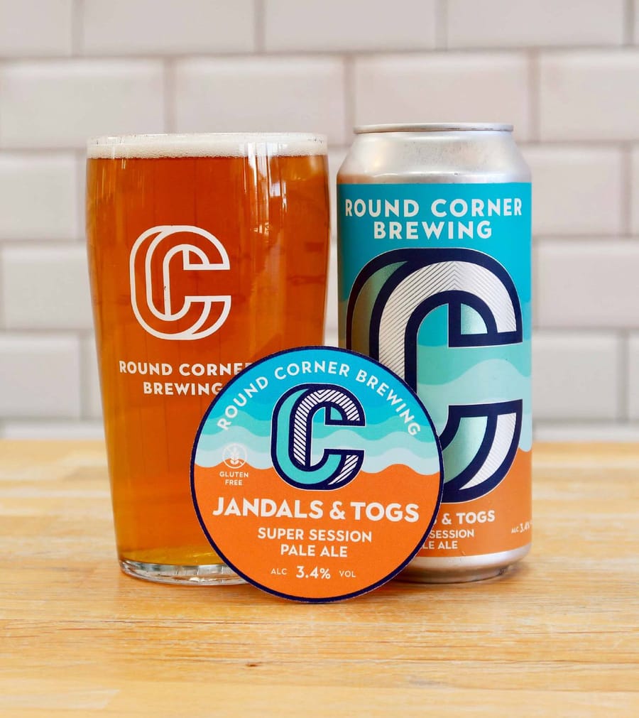
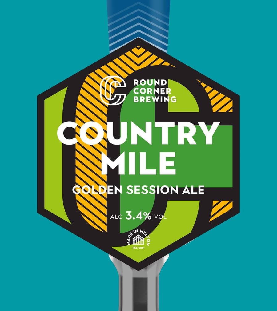
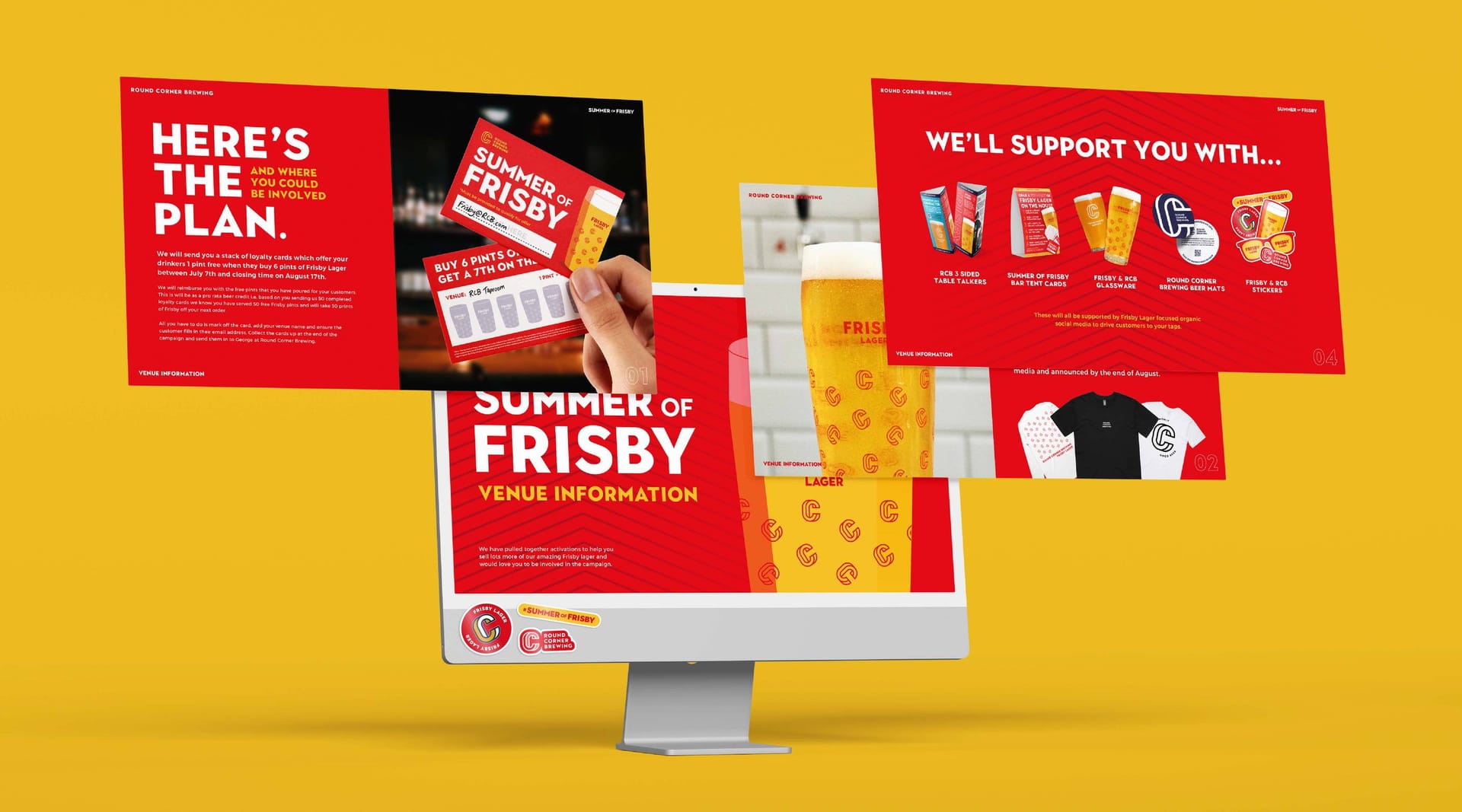
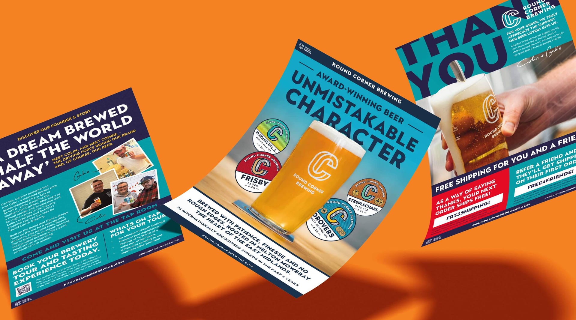
Round Corner now has a more refined, story driven brand that reflects the quality and character of the beer. These foundations have shaped packaging, campaigns, new products and retail, creating a more consistent experience wherever the brand appears. Our ongoing partnership continues to support its growth with clarity, confidence and creative consistency.
Client perspective
“OnPoynttookthetimetounderstandwhatmakesRoundCornerdifferentandhelpedusputintowordswhathadalwaysbeeninstinctivetous.Theygaveusaclearerstory,toneofvoiceandsetofprinciplesthatnowguidehowthebrandshowsupacrosseverythingwedo.Sincethen,theyhavebecomeatrustedcreativepartner,supportingusacrosspackaging,campaigns,retailandnewproductlaunches.Theyunderstandthebrand,challengeuswhenneededandconsistentlyproduceworkthatfeelsunmistakablyRoundCorner.”
— Round Corner Brewing
Related work
View a similar project
Selected by category with a curated fallback so there is always something relevant to continue to.
Print
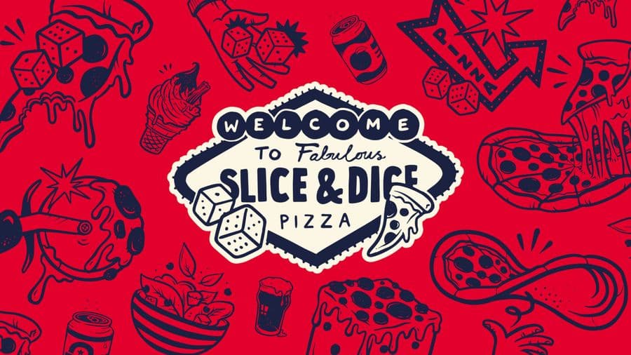
Slice & Dice
A Las Vegas themed pizza kiosk built around a simple hook: buy a slice, roll a dice, maybe win another. We designed the kiosk, signage, uniforms, social and packaging, then scaled it as the concept grew from Oxfordshire to London.
View Project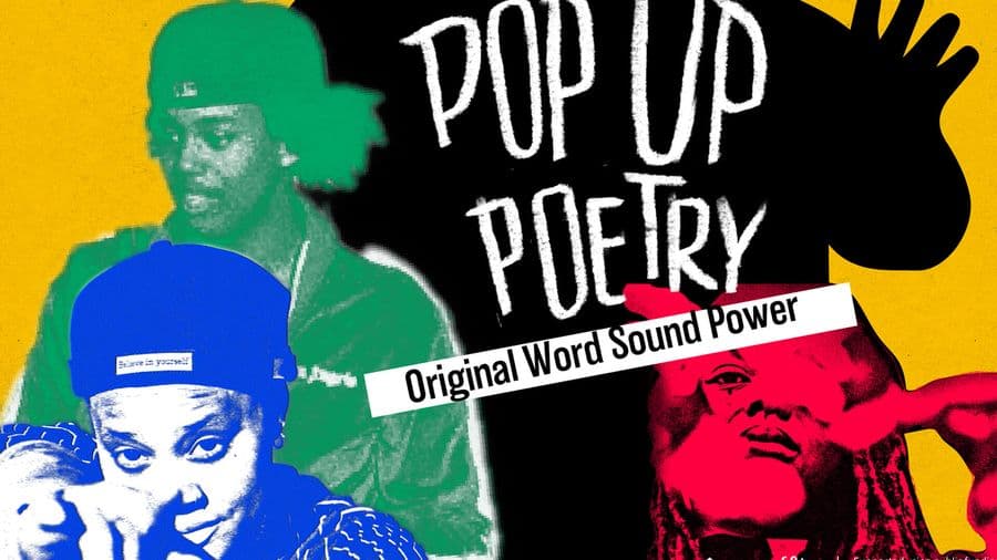
Print
Opal 22
Illustration-led branding for a Leicester Black heritage charity's flagship Black History Month events. We gave each event its own identity across a brochure, posters, leaflets and merchandise, creating cohesive assets the charity now owns and reuses year after year.
View Project
Branding
Endeavour Adventures
A scout-badge inspired brand refresh for a youth adventure holiday business. We updated the logo and built brochures, roller banners and social frames, giving a proven outdoor operator a fresher, more commercial and more trustworthy look built for growth.
View ProjectCREATIVE & BRANDING AGENCY
WHERE CREATIVITY, STRATEGY AND PURPOSE CONVERGE TO BUILD BRANDS PEOPLE BELIEVE IN
2026®