Case Study
Celebrating the character behind Ferneley’s
The Challenge
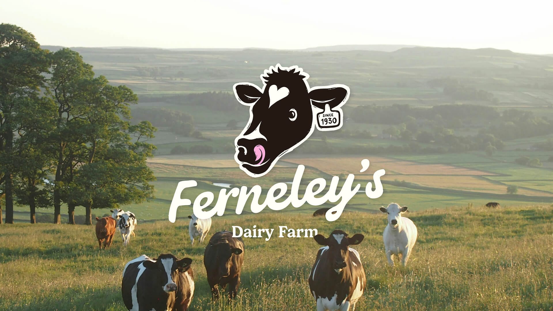
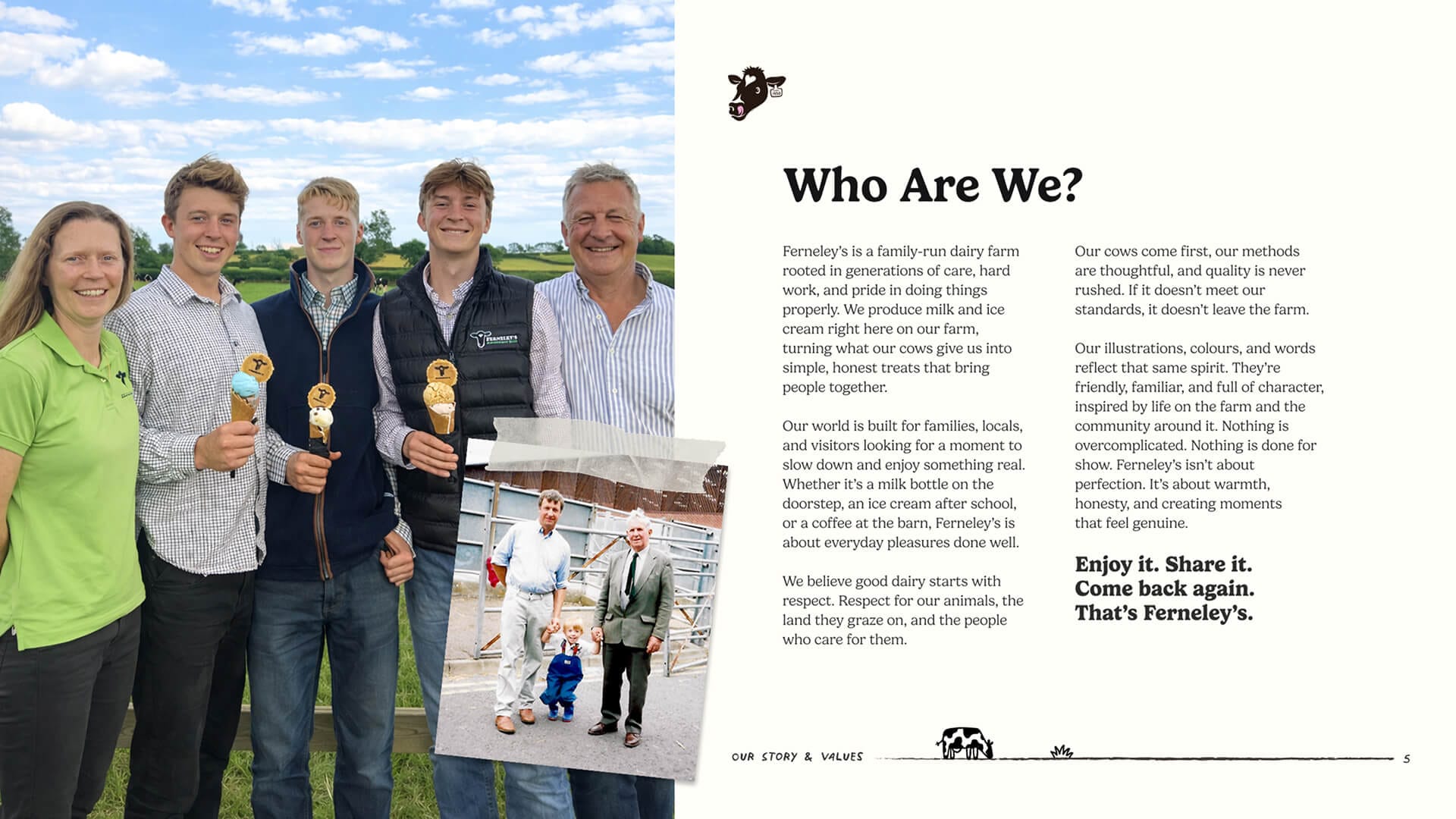
Ferneley’s is a fourth generation dairy farm that expanded into milk rounds, ice cream, wholesale and its own café. Growth had been driven by product quality and local reputation, but the identity felt inconsistent and too rustic for the business ahead. It needed to feel credible in premium farm shops without losing the family character people already valued.
Our Approach
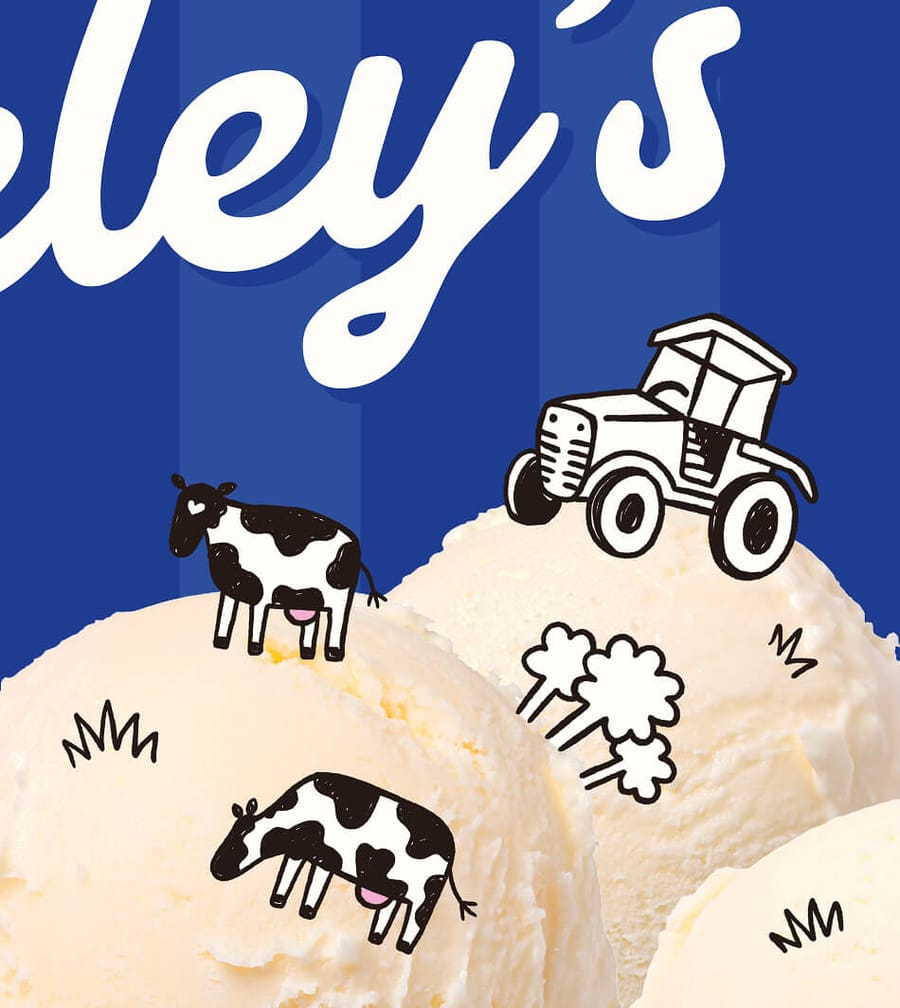
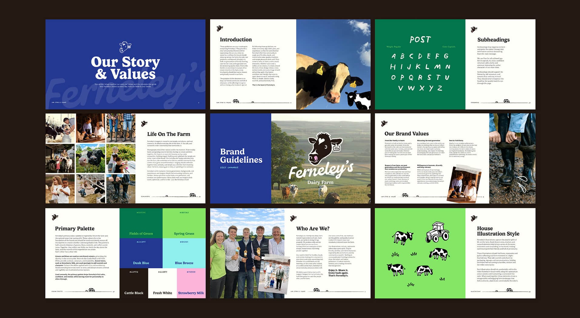
We treated the project as an evolution rather than rejecting what people already recognised. Through workshops, audience research and category analysis, we identified a creative space rooted in British dairy heritage. Etched illustration, elegant serif typography and a palette of navy, cream and raspberry gave the brand greater distinction while preserving its warmth, familiarity and sense of place.
Our Solution
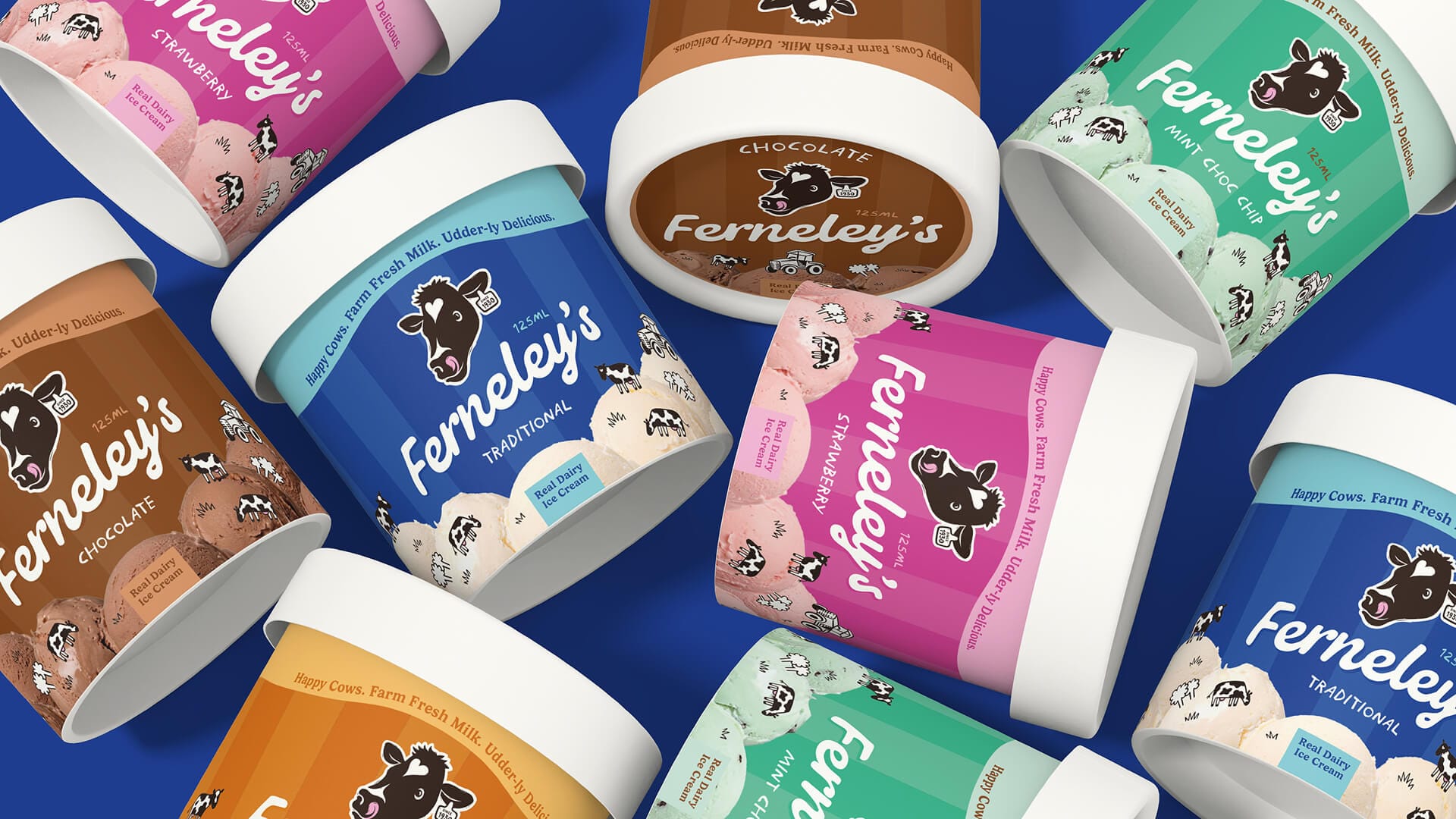
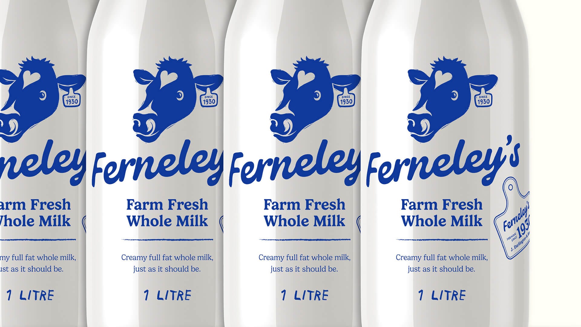
The completed identity gives Ferneley’s a flexible toolkit for every stage of its growth. Packaging for milk bottles, ice cream tubs and wholesale products balances character with practical production requirements through simple print treatments, flexible stickers and repeatable formats. The next phase will extend the system across the café, point of sale, social content and a new website.
Client perspective
“WearereallypleasedwiththenewidentityandhowwellOnPoyntunderstoodwhatwewantedtoachieve.TheyrecognisedthatthebrandneededtogrowwiththebusinesswithoutlosingthefamilycharacterandfarmingheritagethatmadeFerneley’swhatitis.Theresultfeelsconsidered,distinctiveandstillcompletelytruetous.Ithasgivenusamuchstrongerfoundationforourproductsandweareexcitedtobeginrollingitoutacrossthewiderbusiness.”
— Ferneleys
Related work
View a similar project
Selected by category with a curated fallback so there is always something relevant to continue to.
Print
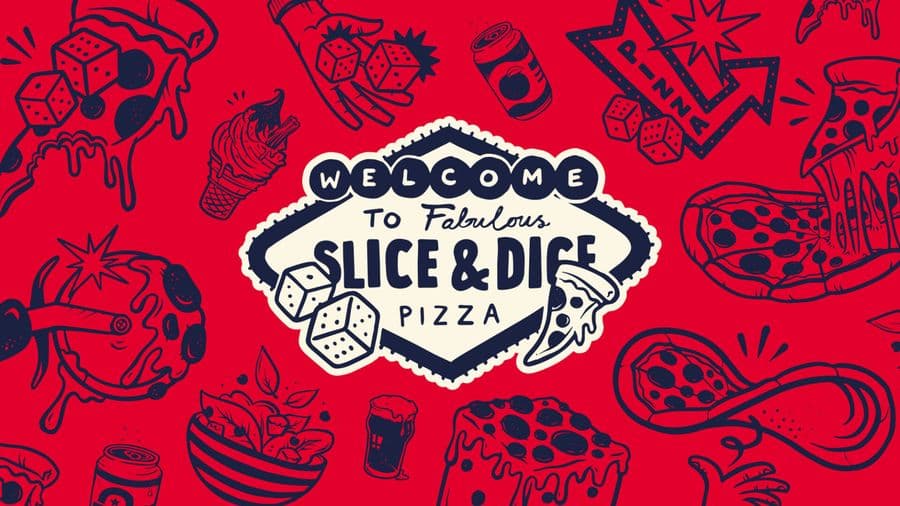
Slice & Dice
A Las Vegas themed pizza kiosk built around a simple hook: buy a slice, roll a dice, maybe win another. We designed the kiosk, signage, uniforms, social and packaging, then scaled it as the concept grew from Oxfordshire to London.
View Project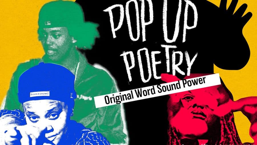
Print
Opal 22
Illustration-led branding for a Leicester Black heritage charity's flagship Black History Month events. We gave each event its own identity across a brochure, posters, leaflets and merchandise, creating cohesive assets the charity now owns and reuses year after year.
View Project
Branding
Endeavour Adventures
A scout-badge inspired brand refresh for a youth adventure holiday business. We updated the logo and built brochures, roller banners and social frames, giving a proven outdoor operator a fresher, more commercial and more trustworthy look built for growth.
View ProjectCREATIVE & BRANDING AGENCY
WHERE CREATIVITY, STRATEGY AND PURPOSE CONVERGE TO BUILD BRANDS PEOPLE BELIEVE IN
2026®